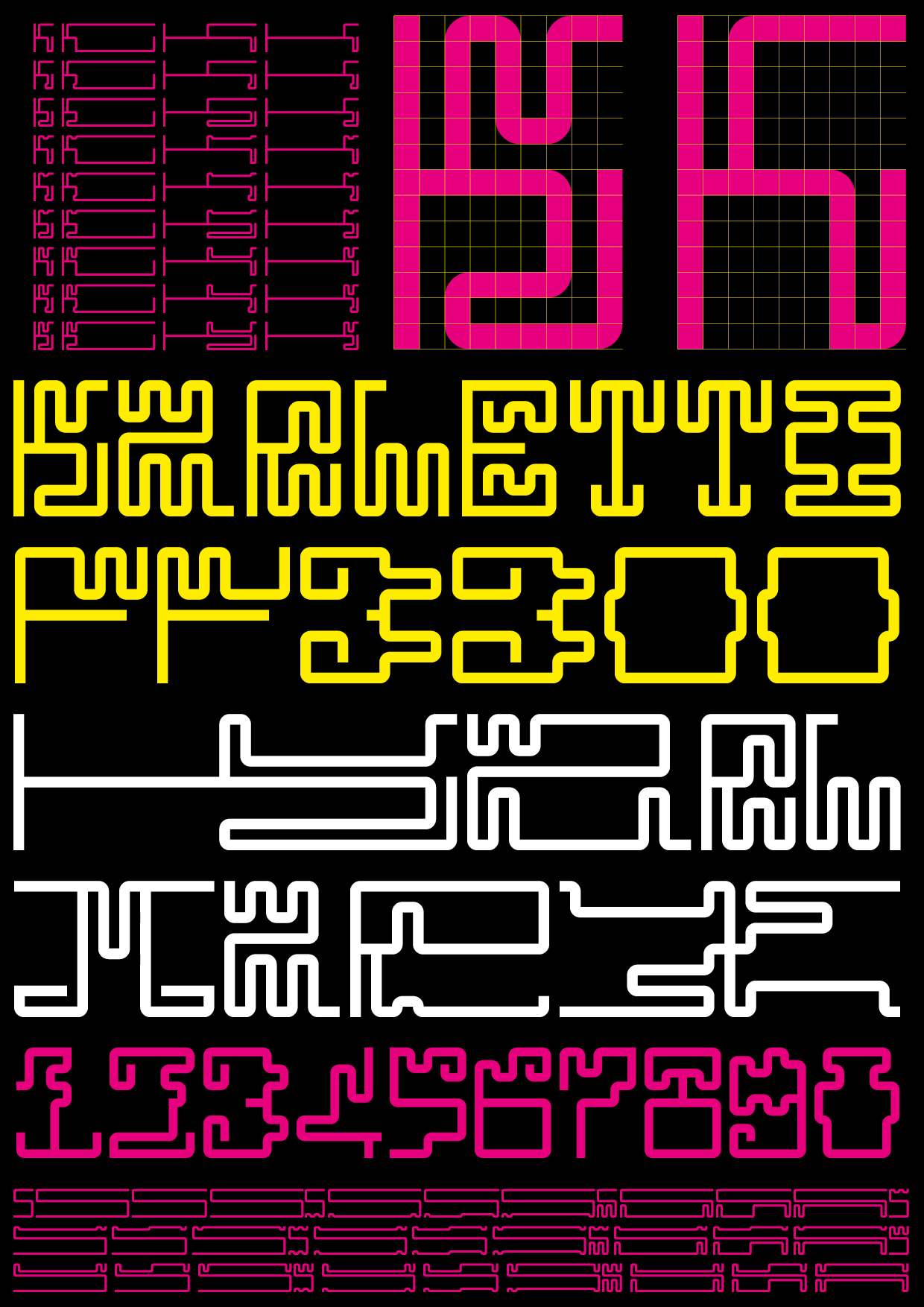
Karletto is a research project reflecting on the “topography” of typography: what letters are and what makes them legible (or illegible).
Karletto was developed out in two phases:
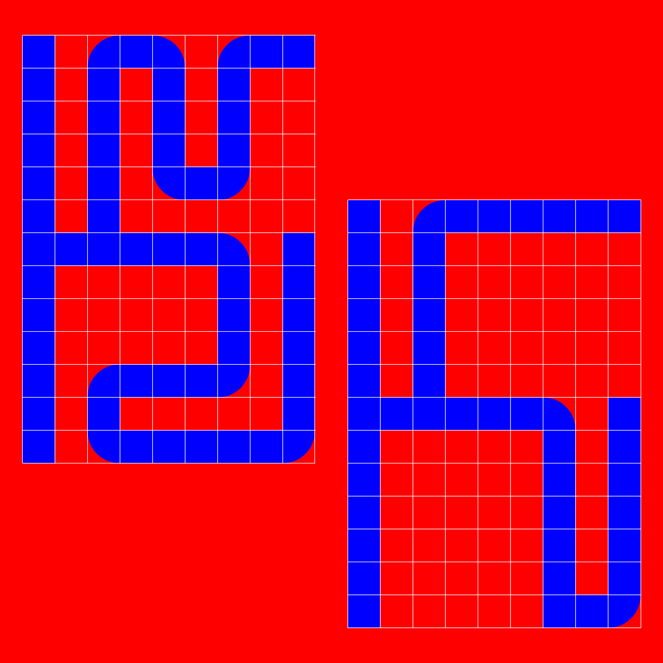
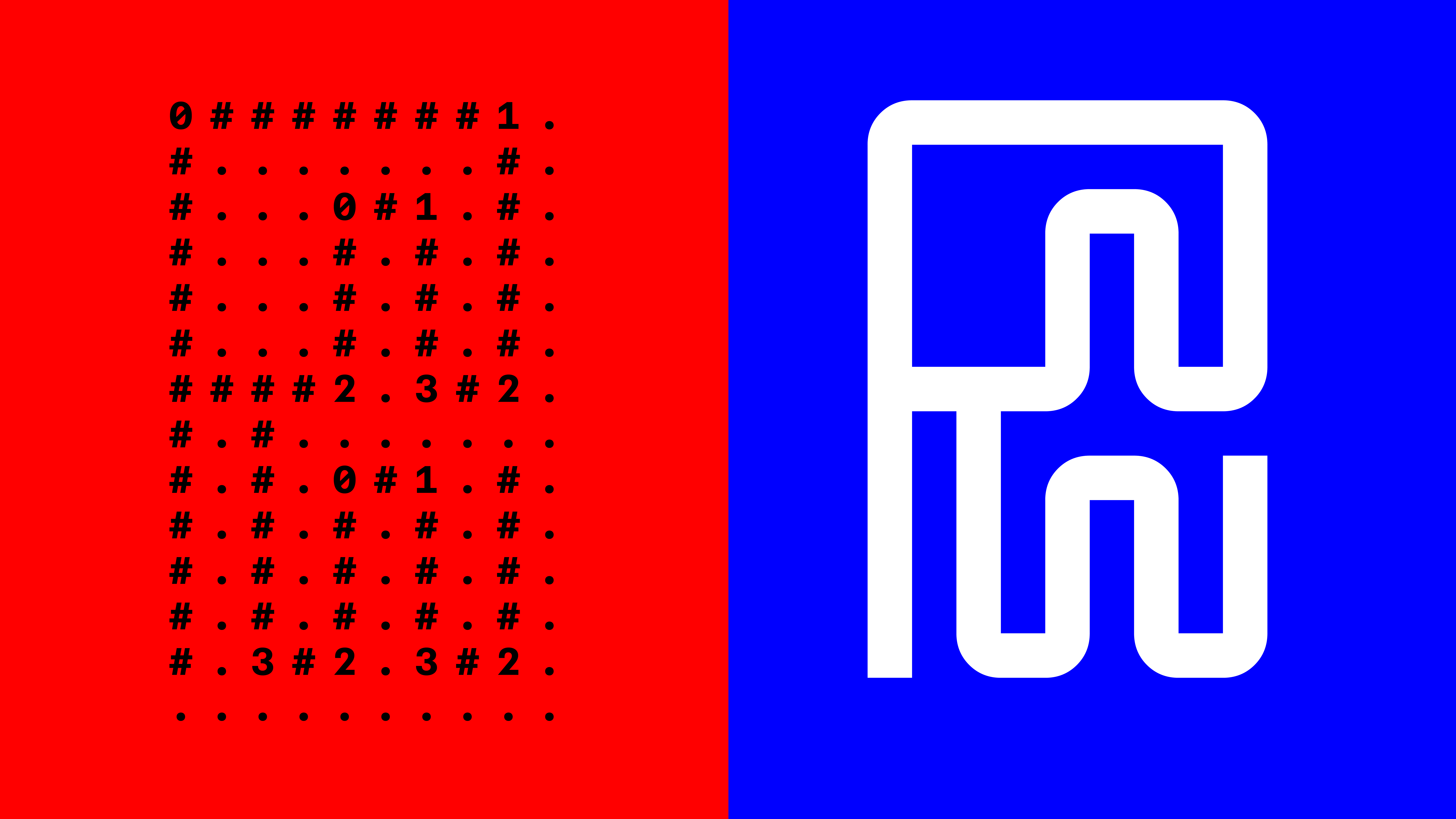
✍️ first the letters were drawn with GTL (repo - tool for browser) - a tool developed by The Open Source School and perfect for the development of lazy-brutal-discrete typefaces, allowing a fast and flexible drawing process: only by changing the syntax can endless variations be generated for the same letter structure!
📐 then the typeface was engineered with Gyphs.
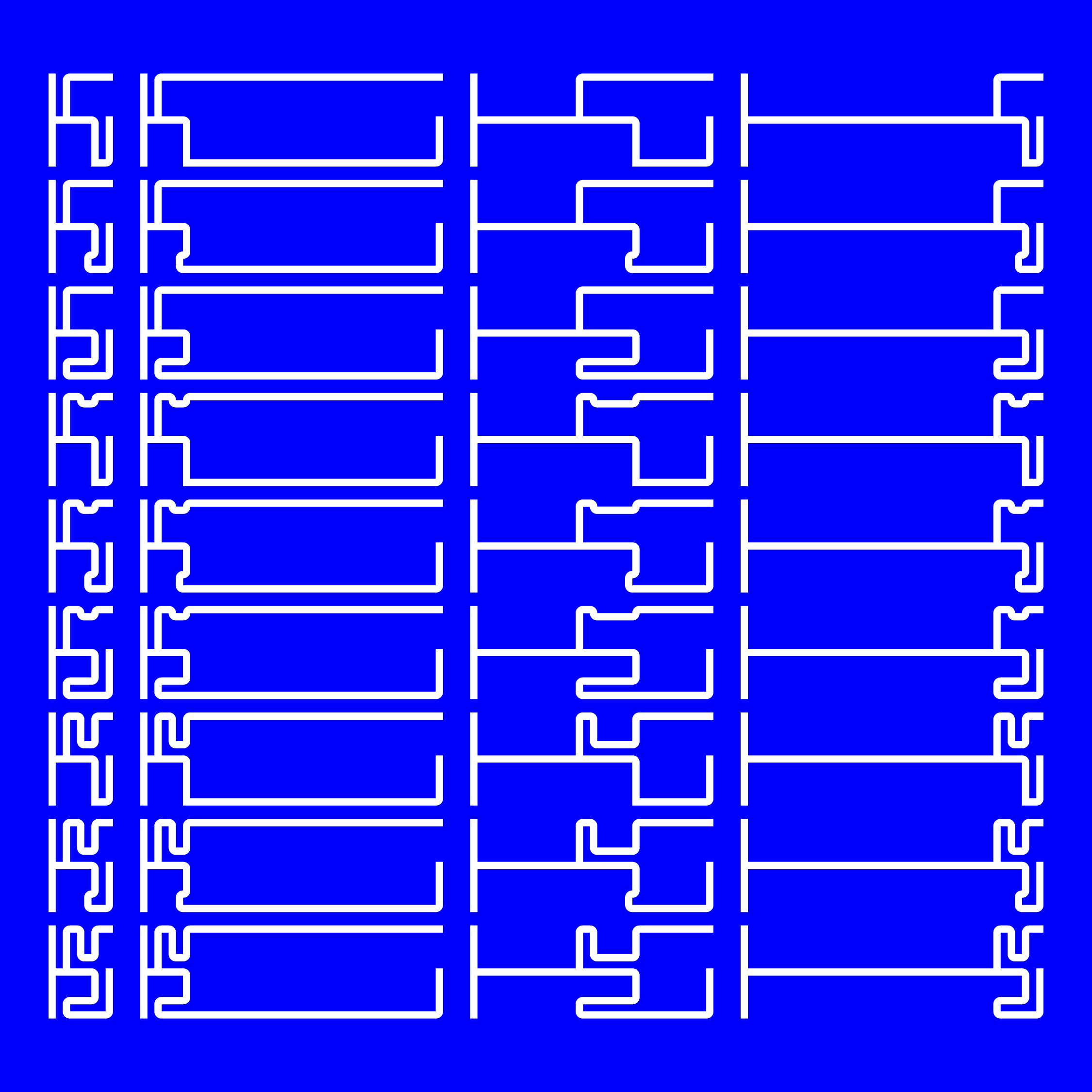
A variable 'unicase' typeface with four axes:
Top
-> controls the overhang of the curves at the top of the glyphs
Bottom
-> controls the overhang of the curves at the bottom of the glyphs
Left
-> controls the elongation of the left glyphs
Right
-> controls the elongation of the letters on the right.

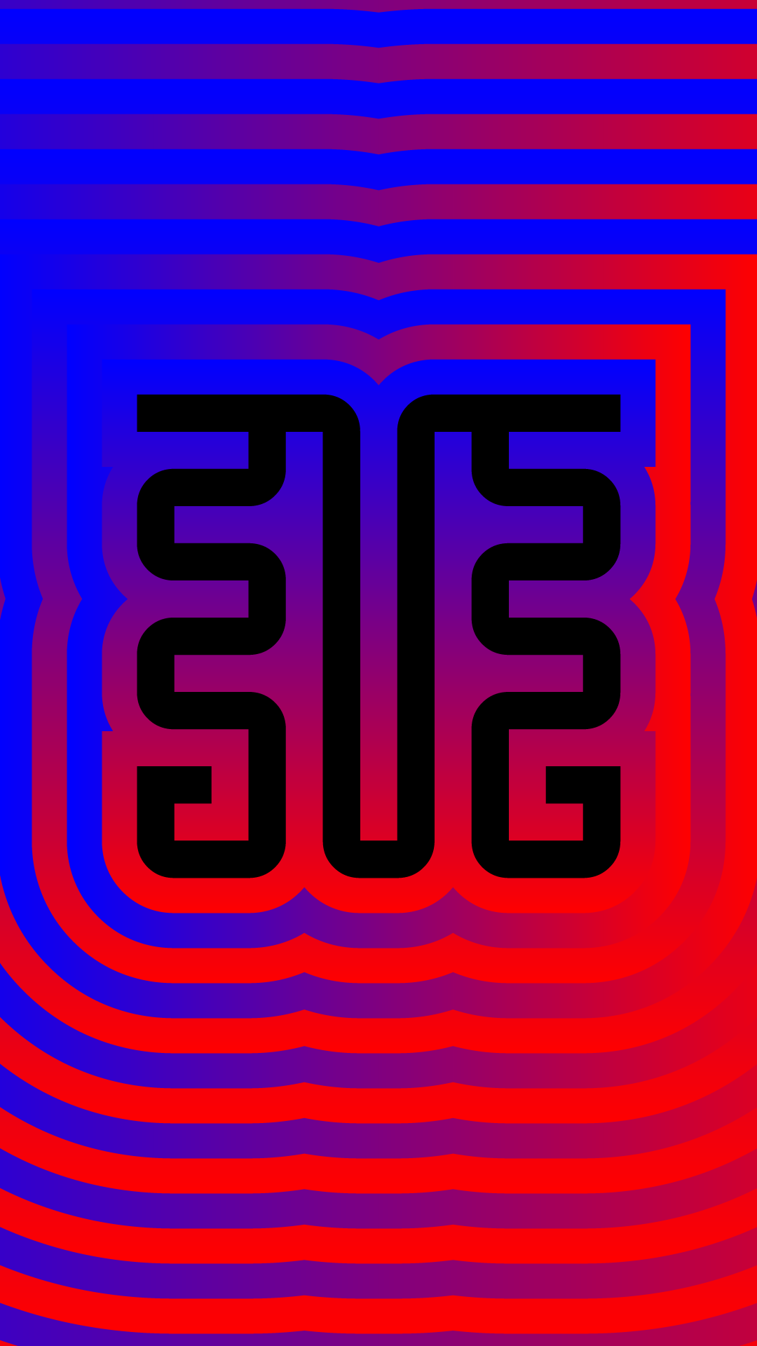

The typeface's name was inspired by 'Darling the Prince of Monsters', which, like our typeface, was elongated and playfully monstrous.